OBJECTIVE
Conversion of the illuminated advertising signs of the rade de Genève in artistic message. Transpose issues commercial and advertising related to the prestigious site of the roadstead in artistic interventions in the heart of the city.
APPROACH
Following the careful reading of the documents given consideration Visual proposed the competition, and next to personal work maintained around the reflection of light from a fifteen years, a project proposal is quickly drawn, almost imposed on me. Indeed, there is, in this panorama of the Rade de Genève, a colorful vertical rhythm induced by the reflections on the surface of the water which, with evidence and relevance, is immediately registered as conceptual articulation point. The project that I submit to you is built from the image of the Harbour and the verticality of the luminous reflections. La Rade de Genève, with its Lake, its water and its illuminated signs, is one of the prestigious advertising storefronts in the city. The world of business, trade, tourism and luxury meets. Conversely, the Plaine de Plainpalais is a popular place which hosts markets, many mafestations point and festive. It is a versatile place, with social and cultural vocation for Geneva, which is located in the heart of a rapidly changing neighborhood in which are found many institutions.

THE IDEA
Combine, unify these different criteria, these two worlds have led me to the design of this facility in the representation of a bar code. The idea was to unite a double emblem of consumption (bar code and neon sign) to a plastic expression (light installation). -as a reconciliation between Geneva and Plainpalais.0
Symbol nearly universal consumption and information, recognizable by all, including social and cultural boundaries do not take place, the shape of the bar code would clearly involve symbolically art and consumption, production (and do not lose sight of the precursors that are Dan Flavin, Bruce Nauman, Carston Holler...). "Ubiquitous, barcodes are discrete actors of everyday life", transpose this common symbol a more prestigious status of a neon color corroborates the idea of combining the Plaine de Plainpalais, popular place and the Rade de Genève, prestigious venue.
THE SIGN
For its composition, my choice fell on code 39 * for its specific characteristics. This alphanumeric code in effect to codify the letters of the alphabet and the numbers 0-9. It is using this consolidation I declined the title of the 'Neon 4' competition for this project. The alphanumeric output is the following :
N : 000010011 E : 100011000 O : 100010010 N : 000010011 S : 001000110 4 : 000110001
Converted to barcode, the letters become vertical light boxes forming the sign. Visible in white and black agenda, and colorful light appearance night, sign, thus studied, is of dual nature: correlative merchant appearance to the appearance of the bar code in daytime vision, it magnifies color night vision and becomes a colourful light installation. Joyful.
Alphanumeric translation of "NEON" 4 >

THE COLORS
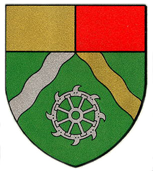
Armoiries de Plainpalais

Conversion of the illuminated advertising signs of the rade de Genève in artistic message. Transpose issues commercial and advertising related to the prestigious site of the roadstead in artistic interventions in the heart of the city.
APPROACH
Following the careful reading of the documents given consideration Visual proposed the competition, and next to personal work maintained around the reflection of light from a fifteen years, a project proposal is quickly drawn, almost imposed on me. Indeed, there is, in this panorama of the Rade de Genève, a colorful vertical rhythm induced by the reflections on the surface of the water which, with evidence and relevance, is immediately registered as conceptual articulation point. The project that I submit to you is built from the image of the Harbour and the verticality of the luminous reflections. La Rade de Genève, with its Lake, its water and its illuminated signs, is one of the prestigious advertising storefronts in the city. The world of business, trade, tourism and luxury meets. Conversely, the Plaine de Plainpalais is a popular place which hosts markets, many mafestations point and festive. It is a versatile place, with social and cultural vocation for Geneva, which is located in the heart of a rapidly changing neighborhood in which are found many institutions.

THE IDEA
Combine, unify these different criteria, these two worlds have led me to the design of this facility in the representation of a bar code. The idea was to unite a double emblem of consumption (bar code and neon sign) to a plastic expression (light installation). -as a reconciliation between Geneva and Plainpalais.0
Symbol nearly universal consumption and information, recognizable by all, including social and cultural boundaries do not take place, the shape of the bar code would clearly involve symbolically art and consumption, production (and do not lose sight of the precursors that are Dan Flavin, Bruce Nauman, Carston Holler...). "Ubiquitous, barcodes are discrete actors of everyday life", transpose this common symbol a more prestigious status of a neon color corroborates the idea of combining the Plaine de Plainpalais, popular place and the Rade de Genève, prestigious venue.
THE SIGN
For its composition, my choice fell on code 39 * for its specific characteristics. This alphanumeric code in effect to codify the letters of the alphabet and the numbers 0-9. It is using this consolidation I declined the title of the 'Neon 4' competition for this project. The alphanumeric output is the following :
N : 000010011 E : 100011000 O : 100010010 N : 000010011 S : 001000110 4 : 000110001
Converted to barcode, the letters become vertical light boxes forming the sign. Visible in white and black agenda, and colorful light appearance night, sign, thus studied, is of dual nature: correlative merchant appearance to the appearance of the bar code in daytime vision, it magnifies color night vision and becomes a colourful light installation. Joyful.
Alphanumeric translation of "NEON" 4 >

THE COLORS
Armoiries de Plainpalais

Always remaining in this login system, the choice of colors is symbolic. In this case, the predominance of green with a touch of red (the letter "s") is in relation to the arms of Plainpalais.